How Sustainable is Your City’s Transportation Network?

A top global transportation organization is laying out the essential metrics that all communities should track if they want to understand how sustainable they really are — and giving advocates a tool to see how well their neighborhoods stack up right now.
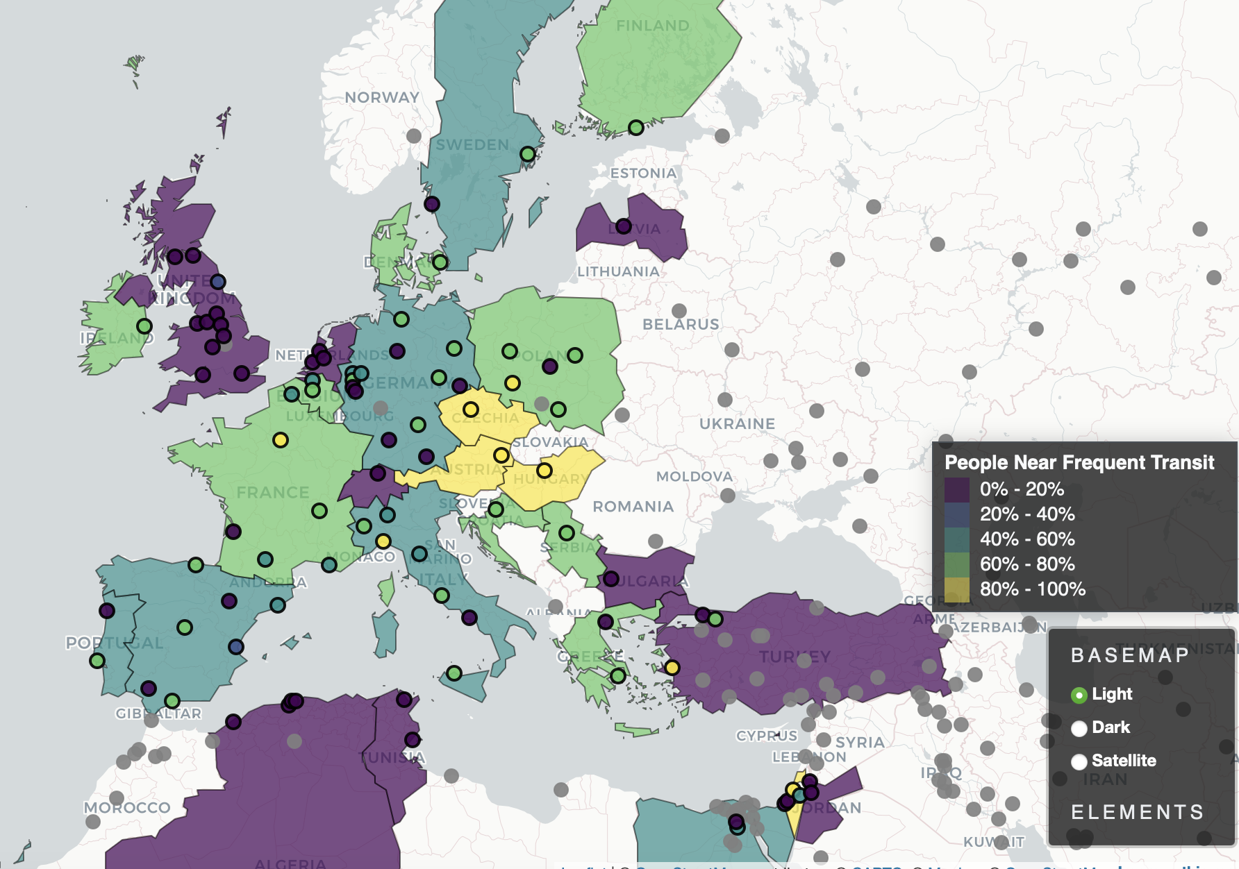
The Institute for Transportation Development and Policy recently unveiled a powerful new interactive “atlas” which allows anyone to see, at a glance, what percentage of area residents live near protected bike lanes, rapid transit, car-free places, and more, and how those numbers compare to cities around the world. In some regions, the tool is able to break down the data at the level of the municipality, neighborhood, and even the council district or ward, potentially revealing hidden inequities that advocates can pressure policymakers to fix.
When they do, the researchers say, the results can be powerful. Seattle, for instance, is one of a handful of major U.S. cities that tracks how many residents live near frequent transport — and as it’s worked to improve that metric, the Institute says it’s also become the only major U.S. city to experience an increase in bus ridership.
As people around the world use the Atlas to dig into their own community’s stats, the researchers hope that it will become a similar catalyst for change.
“There are so many more stories in the Atlas than ITDP could ever tell,” said Taylor Reich, data science manager for the Institute. “I think anybody could look at this data and find stories about their own neighborhood. I want to encourage people to compare, say, the wards of DC, or to take a closer look at different municipalities in the Boston area. I hope it will help people individualize these experiences.”

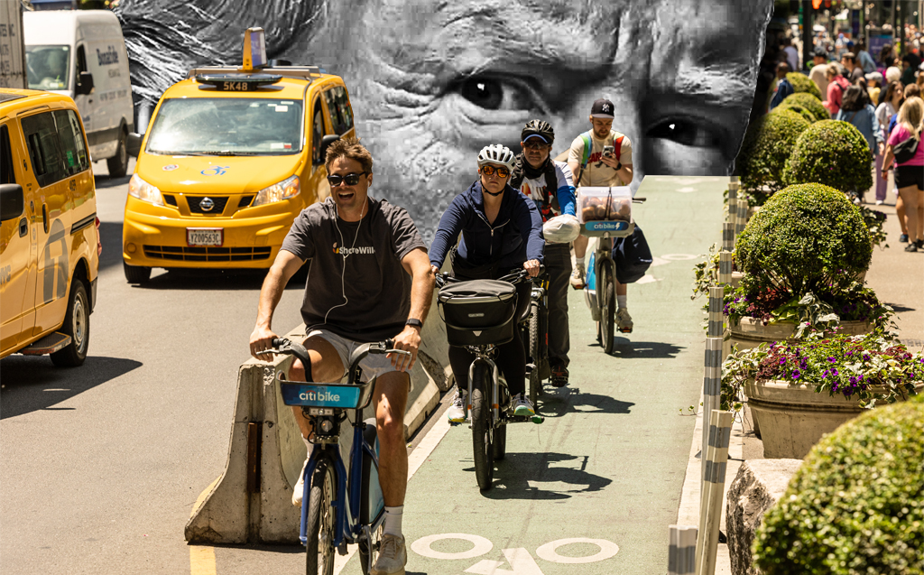
Reich, who uses they/them pronouns, says many of the stories in the Atlas have never been told before — especially in communities where car-focused stats like “average congestion” still reign supreme. The nine indicators in the data set, notably, don’t include auto-centric metrics like the proximity of electric car chargers, focusing instead on data points that illustrate how easy it would be for residents to live car-free or car-light.
Reich says they’re particularly proud of a new “block density” measure, which tracks how many of an area’s blocks are short and walkable, enabling pedestrians to avoid long, circuitous routes just to access safe crossings. (Milwaukee tops the U.S. list on that measure; Detroit, the Motor City, comes in second, interestingly enough.)
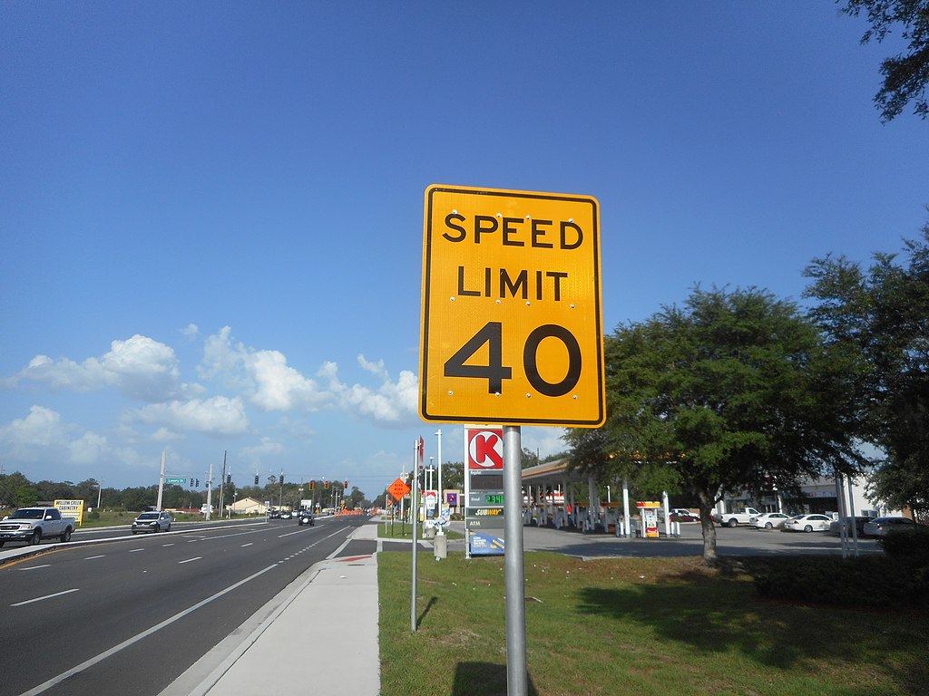
The Atlas also breaks down things like what percentage of the population lives within walking distance of education and healthcare services — a serviceable proxy for whether a municipality has achieved “15-minute city” status — how many live near a combination of bike infrastructure and good transit, and how many are “safe” from highway pollution, meaning they’re living more than 500 meters away from the deadliest and dirtiest roads.
Of course, none of those metrics can tell a community’s entire transportation story on its own. (The U.S. metro with the most residents “safe” from highways, for instance, is car-dominated Tucson, even if sprawl has encouraged residents to live further away from the two interstates and many state routes that rip through the region.) Taken together, though, the Institute hopes the Atlas will give leaders a set of meaningful benchmarks to strive for, encouraging healthy competition between peer cities along the way — and even between sister communities on opposite sides of the globe.

Reich points out, for instance, that the weighted population density of Berlin (10,000 residents per square kilometer) is actually less than the weighted population of the areas around cities like Houston (11.5 per km), Philadelphia (12 per km), and Norfolk, Conn. (14.8 per km) — raising the question of why none of those U.S. metros offers transit service on par with German capital, which ranks 14th in the world on the “people near frequent transit” metric. Houston, the highest-ranked of the three, comes in 92nd.
“We often think of Berlin as a paragon of sustainable transport and urban accessibility, but the weighted population density of a lot of cities in the U.S. is actually quite comparable,” Reich added. “But Germany has a much more extensive rapid transit network; there’s nothing standing in the way of us having that here.”
As more cities work to achieve their full sustainable transportation potential, Reich hopes the Atlas will grow and change, too. Reich says the Institute plans to update the database every year, and advocates are invited to edit any faulty data they might find; the whole database runs on Open Street Maps wiki data, which is powered by community insights. The group also hopes to someday add metrics like how long it takes to complete the average trip distance by public transit, or how complete the sidewalk network is. (Reich says statistics on things like traffic violence and pedestrian behavior, unfortunately, are probably out of reach, since that data is collected in so many different ways around the world, and some communities, like the United States, are collecting less of it than ever.)
Still, if nothing else, Reich hopes the atlas will help change the conversation about what makes a transportation network truly sustainable — and why every community needs to get to work to achieve that ideal.
“There’s so much in there that even I haven’t even seen,” they added. “I’m just really excited to see how people use it.”

Read More:
Streetsblog has migrated to a new comment system. New commenters can register directly in the comments section of any article. Returning commenters: your previous comments and display name have been preserved, but you'll need to reclaim your account by clicking "Forgot your password?" on the sign-in form, entering your email, and following the verification link to set a new password — this is required because passwords could not be carried over during the migration. For questions, contact tips@streetsblog.org.