A 12-Block Shared Space Neighborhood Rises Along the Potomac

Earlier this month, Streetsblog went on a streak about “shared space” — the idea that some streets can work better when, instead of using curbs and traffic signals to separate users, pedestrians get priority using subtle but effective visual cues. We interviewed a key shared space messenger, Ben Hamilton-Baillie; we showed off built examples in Pittsburgh and Batavia, Illinois; and we discussed the potential of shared space to transform the narrow streets of New York City’s Financial District.
Many of the historic examples of shared space that remain, like Market Square in Pittsburgh, Haymarket in Boston, or South Street Seaport in New York, are within what were wholesale markets or ports, where people, goods, and vehicles always intermingled. Old wharves and quays have become distinctive destinations in many cities, from Provincetown to Seattle’s Pike Place Market — and an inspiration to others who want to create human-scaled environments today.
Washington, DC, had just such a working waterfront for centuries, but bulldozed almost all of it in the 1950s amidst federal fervor for slum clearance and urban renewal. Just a few weeks ago, developer Hoffman-Madison Waterfront broke ground on the Wharf, which will transform 27 acres of land into 12 city blocks housing 3.2 million square feet of retail, residences, hotels, offices, and facilities ranging from a concert hall to a yacht club. Many architects and landscape architects worked together within a master plan designed by Perkins Eastman.
Streetsblog talked with Matthew Steenhoek of Hoffman Madison Waterfront about how the Wharf’s public spaces have been designed to accommodate pedestrians first and vehicles (from semi trucks to the occasional police helicopter) when necessary. Below is an edited transcript.
What are the various kinds of streets and alleys that visitors will find at the Wharf?
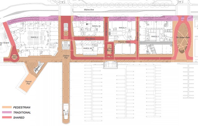
Maine Avenue [on the land side of the site] has a pretty traditional street section with four lanes: vehicular traffic, turn lanes, parallel parking, and street trees. There will be a grade-separated, bidirectional cycle track on Maine’s south side, outside of the existing street trees but separated from the sidewalk by a second row of trees. We’re using permeable asphalt for the cycle track because it goes over the critical root zone for those big old street trees. On Maine, you have a channelized design: traffic moves faster, there’s a lot of through bicycle traffic connecting to the [Potomac and Anacostia riverfront] trails, so the through traffic happens there. We’ll leave the median lanes utility-free and streetcar-ready, so if the District decides to build a line through there they can do so at a much lower cost.
As you move into the site, it transitions into the shared space approach. Besides the two major [entry] intersections at 9th and 7th, it’s all curbless. The public street ends at the Maine Avenue cycle track, and from there in they’ll be private streets. This gives us much more latitude in terms of our design approach, so we can vary from traditional street standards and requirements.
Differences in paving material, texture, color, and pattern will help differentiate the spaces within the major public spaces. There’s also bollards to separate the edge and center of the street in busier locations.
There are a lot of clues built into the paving, which will use a kit of different pavers. There will be a smooth and continuous path dedicated for pedestrians, while the places where vehicles are allowed as guests will have a split-block finish with a little rougher texture. In order to slow the speeds down, the paving patterns will change as you transition from one zone to another — like where you might be introducing pedestrians or bikes into the space. The smooth surface in no way limits where the pedestrians can go, though, and the curbless environment invites pedestrians to really use the entire space.
There aren’t a lot of obstructions within the spaces. They’re straightforward and kind of utilitarian, designed to be able to be closed, or partially closed, [to cars] when it’s busy. Restaurant seating can spill out there, and the shared space can become a true public space.
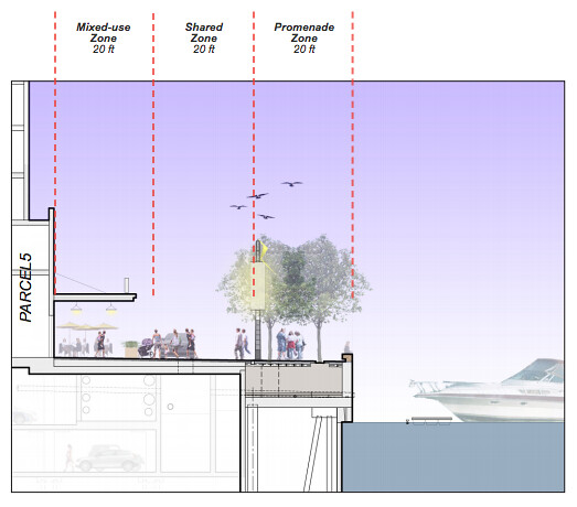
Wharf Street runs directly along the water’s edge. It has a typical section of 60 feet across, with three modules: The closest 20 feet [to the buildings] is a café seating zone, where the paving is smooth and flat so that they can move furniture around. Right outside there is a dedicated pedestrian path, then the shared movement, or travel, zone — one way for vehicles moving or parking or loading, but cyclists and pedestrians can go any which way. The movement space is the center 20 feet, using smaller, more textured pavers.
The outside 20 feet has a dual allée of trees, and it’s where the fixtures and street furniture are — no bollards, but there are trees. That zone, again, has a smooth texture. Along the bulkhead [seawall], there’s a huge wooden timber down the side for people to sit on. We also have flexible seating all throughout. Having the flexible seating is part of the traffic calming: things are going to change and feel different every day.
Throughout the parcels, there are alleyways that come through. Those are much tighter, more intimate spaces, from 25 to 40 feet wide. The alleys are not back alleys, they’re public spaces — not a place for stinky exposed dumpsters leaking things. DC got rid of most of its alley buildings [via the early 20th century’s Alley Housing Clearance Commission], but the few alleys that are left are pretty great.
The only place where 55 foot long trucks are allowed is at the concert hall [at the west edge of the development]. Everywhere else will only have deliveries on 30 foot trucks. Since we have retail on all sides of the buildings, it’s tricky to find the “back of house” space [service entrances]. The idea has been to work with [retail] operators on loading hours, so that during prime pedestrian hours there’s not loading happening, and to screen and integrate the loading areas so that they can function as good public spaces when they’re not being used.
The way that the shared space is set up will encourage everyone to slow down. It’s not a highly predictable zone, which gives people a false sense of security — they don’t look around themselves. The character of the space will allow it to do what it needs to do, while remaining safe and accommodating for all the different users.
Like around 7th Street Park, cars are allowed, but it’s not going to be the fastest route to anywhere. There’s a splash fountain and benches in the middle of the street that you have to make a one-way loop around, and another one down at the District Pier where cars will have to go around to get to Blair Alley.
There’s another totally pedestrian zone at District Pier. That’s the most intense area of pedestrian activity, since there’s lots of things happening here [with the pier and concert hall]. We’ll have another [pedestrian zone] over at M Street Landing across from Arena Stage, and a third at the Waterfront Park, which we designed through a community charrette process. At Waterfront Park, vehicular access is only to dinner cruise boats, and to the police and fire pier. Ninety-nine percent of the time that will be a nice broad path, but the open space is so a police helicopter can land right in the middle.
Can you describe the process of deciding upon a shared space approach?
That was one of the really upfront visions that [design architect] Stan Eckstut had for the site. He saw it as a true, mercantile, flexible space. Having hard curbs really does limit what you can do with the space — what it wants to be in 2017, and in 50 years, may be really different. Very early on, in 2008 probably, we had that 20-20-20 allocation set up for Wharf Street. It’s tight enough to create a comfortable space and encourage that vitality along the water. A lot of thought went into how to execute it, but we always knew it was going to be shared. From the start, everyone bought in on that vision of flexibility. It will be a nice change from most of the new streets and places that are being constructed around the city, some of which are very rigid and kind of sterile.

We have a healthy storefront allowance [for retailers to design their own spaces]. Also, these blocks are relatively small by city standards, around 250 feet square. Since the citywide average is 300-500 feet, our fabric is much more porous than that. [Our historic preservation consultants] came up with a list of old alley names from the neighborhood, some of which we’ll resurrect here as a link to that past. Hopefully, these approaches will mitigate the fact that everything’s new. Ultimately, it needs to get lived in to feel real.
What primary benefits did the shared space approach offer?
Our reason was placemaking. For us, it was starting with a question of “what’s the space going to feel like?” We wanted to bring something interesting and unique — a space that’ll work tomorrow, and in 50 or 99 years, when our ground lease is done. Vehicular capacity wasn’t important, since these are not continuous routes through to anywhere. Most cars will just want to go to and from the garage.
Shared space just made sense for any number of reasons. We wanted to slow the traffic down, but not with obtrusive traffic bumps. These are second-generation traffic calming ideas: adding uncertainty, variety, texture. It’s saying, “Hey, you’re welcome to come in as a motorist, but behave.” Everyone else is going to behave. [Since they’re internal streets] we could have some fun with the signage, something like “walk your car.”
The exponential drop in injuries when cars only move 15 or 18 mph is very telling. At that speed, people can still communicate nonverbally, with eye contact or a nod. Get above that, and that all breaks down, and instead you have to rely on lights and signs and bumps and those crazy things. We’re going a little more low key than that. If everyone’s moving at or below 15 mph, you can negotiate those intersections without the need for stop lights and all that equipment.
Were there other examples that sold you on the concept?
We think that we have the right solution for this place, of course, but we did travel to see other waterfronts. Along Nyhavn, the famous slip in Copenhagen, there’s two strips of smooth pavement that are the width of the pushcarts they used to unload the boats. That street section, how it feels and meets the water, was definitely an inspiration, just because it’s a wonderful place. It’s pedestrian only, because there’s just so many people, but we have the ability to do the same.
Stavanger, Norway, did a really nice thing with the paving to differentiate parking, driving, and walking spaces. We adapted that solution here: It’s all the same tone and all looks about the same, but the textures break things up without putting thermoplastic stripes and giant yellow signs. That makes for a more visually pleasing public environment, creating a public space instead of a traffic sewer.
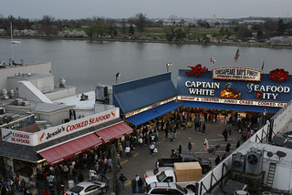
And of course, right now on the site, the shared space that we already have today is the Fish Market. It’s more of a mixing bowl, and it’s functioned that way for years. It works just fine because it doesn’t “work” in a conventional sense, and that’s how it really works.



Comments Are Temporarily Disabled
Streetsblog is in the process of migrating our commenting system. During this transition, commenting is temporarily unavailable.
Once the migration is complete, you will be able to log back in and will have full access to your comment history. We appreciate your patience and look forward to having you back in the conversation soon.