How ‘Skeuomorphism’ Is Making U.S. Roads More Deadly

Editor’s note: this article originally appeared on Carbon Upfront and is republished with permission.
When I saw my first F-150 Lightning in the parking lot in Dorset this summer, I was shocked at how big it was; our Subaru parked behind it wasn’t as high as the tailgate.
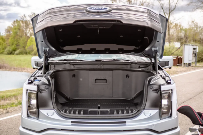
And the front end! It’s my shoulder height with the big hood enclosing … nothing. Where once there was an engine there, now it is a “frunk” or front trunk, 400 litres of air, with a lid that blocks visibility of little people like me in front, destroys aerodynamics, and is significantly more likely to kill the people who get hit by it, sending them under the truck rather than over the hood.
It is designed this way because it is a skeuomorph, described by tech journalist Clive Thompson as “a piece of design that’s based on an old-fashioned object. You’ve invented a newfangled technology, but you design it to look and act much like the old tech it’s replacing.”

The textbook example of skeuomorphism is the original iPhone, which was introduced with notebooks that looked like paper and magazines that came on wooden bookshelves. Apparently, Steve Jobs felt this was important to help us get used to the newfangled device, but those are just images. As Thompson notes, “skeuomorphs also wind up hobbling the new invention. Because skeuomorphs are based on the physical limits of an old-fashioned device, they get in the way of a designer taking full advantage of the new realm.”
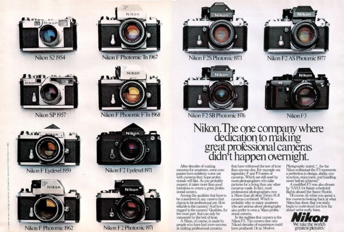
My favorite example of how skeuomorphs hobble is the digital camera. Its predecessor, the film camera, was designed around film rolling out of one spool, across the back of the lens, and then rolled up again.
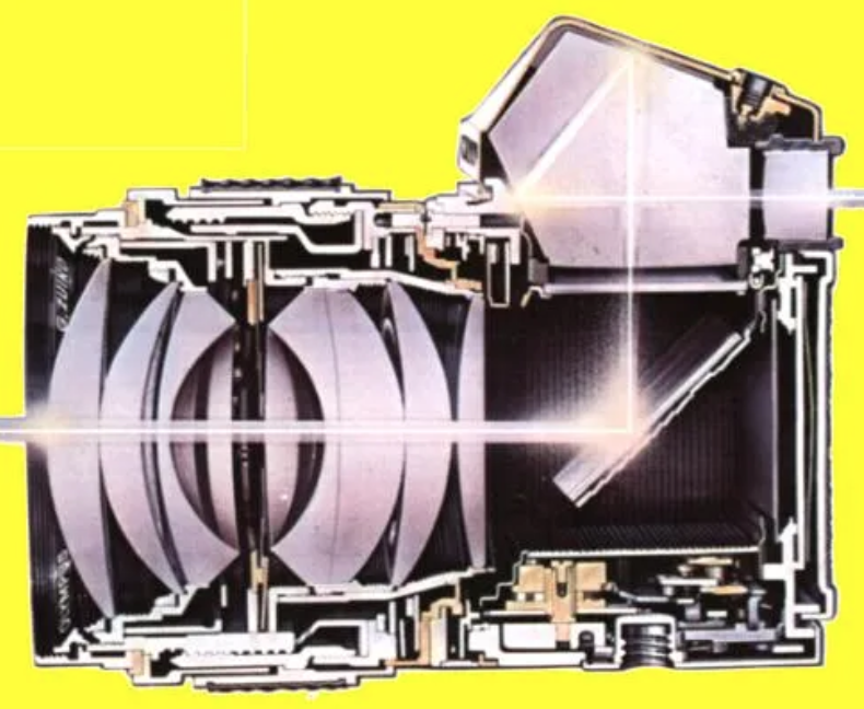
In a Single Lens Reflex (SLR), the thing on top was a pentaprism directing the light from a mirror that flipped up when taking the picture. The camera is designed around the moving film and the light path rather than ergonomics or usability; we had to adapt to it because of the properties of film and light.

When the digital camera revolution hit, Nikon and other camera companies developed designs that took advantage of the freedom from film and light paths to make it more ergonomic and flexible, a camera that adapted to us. You could bend and rotate the Coolpix and look down, up or back at yourself. It bombed.

Look at the latest mirrorless Nikon, and it still has a stupid bump where the pentaprism was, still looks like there is film rolling from one side to the other, and still has the lousy ergonomics determined by film cameras. Apple gave up on skeuomorphs, but cameras are just getting worse.
But at least it’s not going to kill anyone.
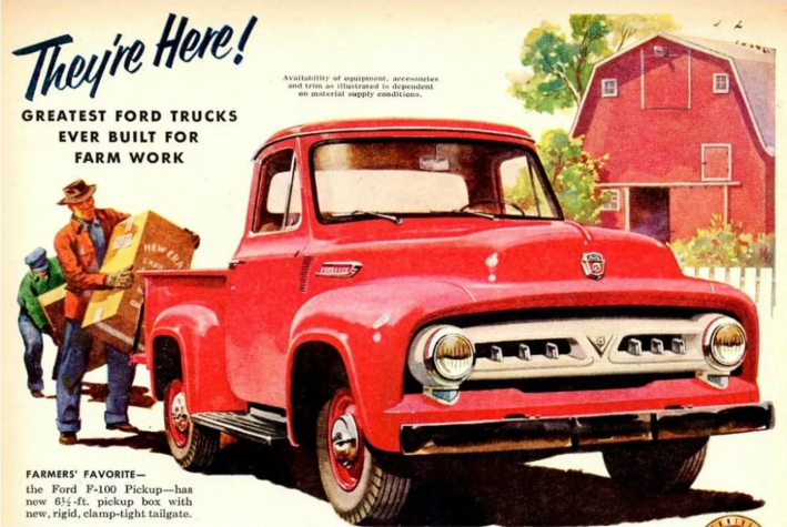
Now we have the pickup truck. It was designed for work, and nothing was bigger than it had to be, the hood was designed around the shape of the engine, and the front end was as low as it could be. In Australia in 1932, Holden made a crossover based on car designs because a farmer’s wife asked for “a vehicle to go to church in on a Sunday and which can carry our pigs to market on Mondays.”
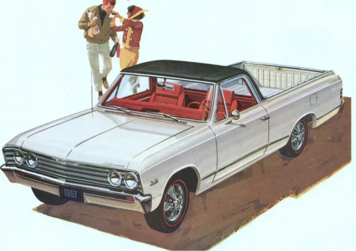
In the 1950s and ’60s, the American Ford Ranchero and the Chevy El Camino were exactly that — the comfort and elegance of a coupé with the utility of a pickup truck. There is a logic to it, but they are more car than truck.
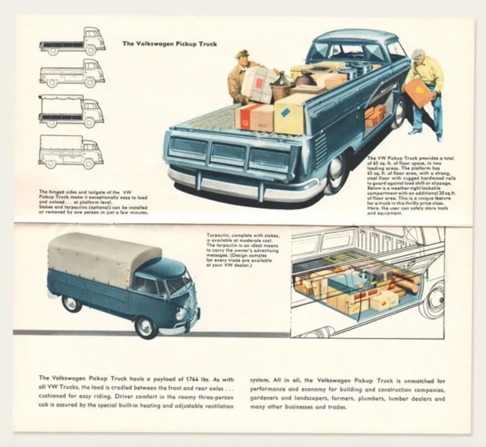
When Volkswagen designed a pickup truck based on their van, they had to make the bed high enough to get over the rear-mounted engine. But they used the space in between for more storage. All VWs were decidedly non-skeuomorphic, they let the engineering drive the design.
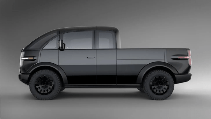
There is one company trying to do this today; Canoo has designed a van and a pickup truck that remind me of the VW. The designer said, “Cars always have been designed to convey a certain image and emotion; however, we chose to completely rethink car design and focus on what future users will actually need.” Critics said, “Personally, I think it is as ugly as sin. Certain shapes are appealing to most people.” The company is struggling to survive.
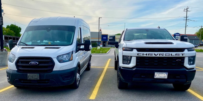
We already know that American pickup trucks’ giant and deadly front end has little to do with function and everything to do with image; otherwise, every truck would look like the Ford on the left, designed to European safety standards, with a lower front end and great visibility.
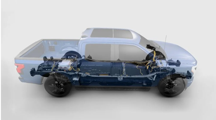
With electric vehicles, it’s even sillier. On the Ford F-150 Lightning, there is a whole bunch of nothing in front of the passenger cabin. But for a bad case of skeuomorphism, it could be lower, safer and more aerodynamic.
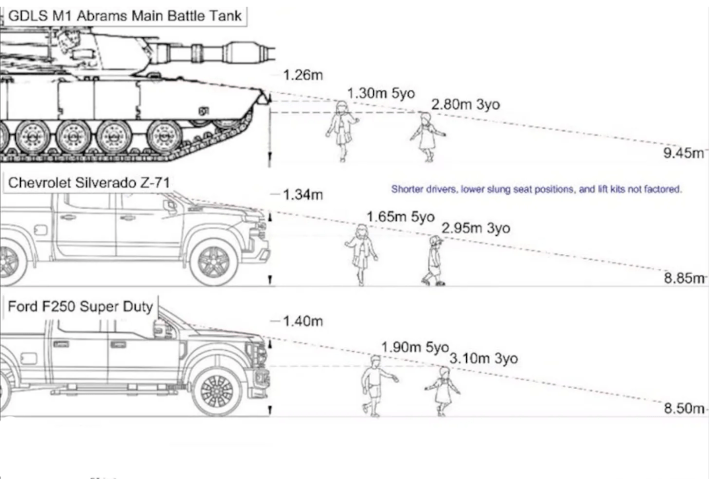
Seriously, children are more visible in front of an Abrams battle tank than they are in front of a pickup truck. The National Highway Traffic and Safety Administration says every year there are about 400 deaths and 20,000 injuries every year because drivers can’t see what is right in front of them.
The electric car revolution is a golden opportunity to redesign the vehicle from the ground up to make it smaller and safer. Instead, as Alissa Walker wrote in Curbed,
If “petro-masculinity” defined the past decade, as oversized, gas-guzzling SUVs and trucks came to make up more than 80 percent of all new vehicle purchases, we’re now heading into an age of “bro-lectrification.” We’ll ditch the fossil fuels but hold on to everything else that’s so toxic about American car culture — the road fatalities, the sprawl, the land and mineral costs of extraction, the bombastic Super Bowl ads equating your masculinity with the size of your zero-emission mobile bunker.
So, we have death by skeuomorphism, fixated on a dangerous design that bears little relationship to its function; it just looks like what the bros think it should look like.
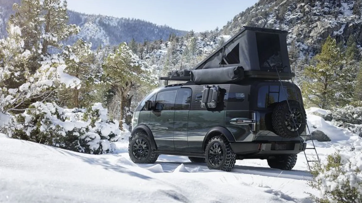
Skeuomorph-free design presents so many more opportunities; personally, I lust after the Canoo camper van. But I can probably dream on; people apparently like what they know, even if it makes no sense.
Streetsblog has migrated to a new comment system. New commenters can register directly in the comments section of any article. Returning commenters: your previous comments and display name have been preserved, but you'll need to reclaim your account by clicking "Forgot your password?" on the sign-in form, entering your email, and following the verification link to set a new password — this is required because passwords could not be carried over during the migration. For questions, contact tips@streetsblog.org.


